Monday, October 25, 2010

Various things I like


I like this design for Journal Deluxe and it's use of overprinting spot colours. It creates quite a dynamic effect and the wave effect is something I'm going to try and apply to the 'Drink The Kool Aid' Jonestown design. I think the really simple geometric nature of it works really well and the different distances they travel across the page creates quite a dynamic effect. I don't think the colours work particularly work, they've gone for 'complimentary' red and green, but I personally don't like the way complimentary colours go together. It seems almost kitsch, like it harks back to the kind of design in the seventies.


This is an example of how extremely simple design can be incredibly effective. The circular shapes create a strong visual presence, and the use of colour (or lack there of) with everything reversed out against it avoids the objects getting lost in loads of white space.


This design by Moshik Nadavad works because it's use of a large amount of negative space, within which sits very clear and regimented design. The cults brief I started seems to be working on a similar principle, though this is actually a much more dynamic and irregular layout to mine, almost simulating elements of collage, in fact it reminds me of some of the work Vickie Simpson produces.


I couldn't find a credit for this design, but I thought the way the symbols worked created quite an interesting and ambiguous aesthetic that I want to capture with the spot varnish elements to my book.


This branding/map design uses very nice typographical choices and a strong logo constructed from a simple tear drop shape. The pattern that it creates as they're overlayed provides something a little more visually stimulating than the use of a tear drop on it's own might.


The thing I really love about this piece of design is the use of geometric shapes combined with very well gridded typography. There are a few thing I dislike, for example the red stripe down the side of the page of body copy. It feels like they were trying to avoid having a blank white page but haven't come to a satisfactory resolution of this problem.


I found this image but I couldn't find a credit. The simple shape and colour presence is again what works, and I think this simplicity is somethign I need to refer back to whenever looking at my own design practice. Throwing too much at something or trying to be too complex can often be a hinderence to a brief, rather than a success. The use of serif type here actually really compliments the design, I wouldn't normally ever use a serif font in my work, but I guess there are a few rare occasions where it may be appropriate.


Finally some more research on identity. The angular shape is a really strong and simple shape thats quite dynamic and it applies well across a range of products in various colours. Again, this shows how effective an ambiguous symbol can be, as long as you get the shapes right you can actually say a lot with not much.

Tuesday, October 19, 2010

Cults, facts and figures

Peoples Temple

-'reaching a maximum of 3000 members'-http://www.caic.org.au/biblebase/apocolyptic/jones.htm

-death toll 914-http://www.angelfire.com/ms/perring/russo.html

-Spiritual leader- Jim 'Dad' Jones.

-Spiritual home. Jonestown Guyana

-Core beliefs= Mixture of Communism, Socialism and Pentecostal Christianity

-founded in 1955

-ended 1978 (at the time of the Jonestown Massacre)

-The use of cyanide-laced Grape flavoured Kool Aid to kill its members has led to the phrase 'Drink the kool aid' which means to blindly accept or believe in something without questioning it.

The Manson Family

-Peak membership around 100: http://mykindofcommunication.wordpress.com/2009/02/20/the-manson-family/

-death toll 7- http://www.religioustolerance.org/dc_charl.htm

-Spiritual leader- Charles Manson

-spiritual home- Spahn Movie Ranch-http://www.huffingtonpost.com/2009/08/06/charles-mansons-ranch-pho_n_253116.html

-core beliefs- Hippie based doomsday cult, predicting a race related end of the world charliemanson.com

-founded in 1967

-ended in 1969

Famous quote' Now is The Time For Helter Skelter'- Charles Manson was obsessed with the Beatles and believed the recently released White Album was a coded message aimed at the Manson Family, instructing them what to do about the coming apocalypse. Helter Skelter was Manson's term for the uprising of the Blacks, the murders he committed were an attempt to bring about the 'Helter Skelter'.-http://www.charliemanson.com/helter-skelter.htm


Scientology

-Peak Membership 10Million and growing-http://publicaffairs.scientology-tor.ca/2006/04/latest-international-scientology.html

-Death Toll: 0 known deaths

-Spiritual leader: David Miscavige, formerly founder Ron L. Hubbard http://www.scientology.org/

-Spiritual Home: Gold Base/int. base San Jacincto California

-Core beliefs: The study of the mind, which like Buddhism is an eternal reincarnating presence. Also the belief that a long time ago in a galaxy far away, a Warlord called Xenu who enslaved a race called the Thetans who were thrown into a volcano o our planet. Their spirits then possess the bodies of humans and cause all their unwanted pain and emotions.-http://www.lermanet.com/scientologynews/santa-cruz-good-times.htm

-Founded 1954-http://stason.org/TULARC/religion/scientology-catechism/1-3-How-did-Scientology-start.html

-still going strong

-Famous Quote- "We are not a cult" stands out after watching the Panorama investigation into Scientology, whenever they were challenge on accusations of being a cult, they would also respond with the same defensive 'We are not a cult'.


This last one I've chosen, not because it's destructive like I had intended with all of them, but because it's ridiculous. If I use this one, then I have one mass suicide cult, one homicidal cult, one thats become/becoming institutionalised and one that is absolutely absurd:


The Raelian Church


Peak Membership: 70,000 worldwide (allegedly) http://rael.org/

Death Toll: 0

Spiritual Leader:Rael (Claude Vorilhon) http://www.gogomagazine.com/0227/coverstory.html

Spiritual Home: The as yet unbuilt Elohim Embassy, a proposed embassy for the Aliens to land.http://rael.org/embassy

Founded in 1974

Still going

Quotes: To describe their God-character, the Aliens that came to populate the Earth at the birth of man, they describe them as the Elohim. 'Those Who Came From The Sky'. It has quite an obscure twang to it, and it definitely sums up their bizarre beliefs quite well.

Friday, October 15, 2010

Rationale and that

Cults brief, research

Listverse handily has a list of their top 10 cults. This gives you a little bit of background on each one. The more interesting ones are the ones where murders and suicides have occurred: Jim Jones' Peoples Temple, Heaven's Gate, Aum Shinrikyo, The Manson Family, The Order Of The Solar Temple and The Branch Davidians. All of which have committed atrocities either against others or within their own cult through mass suicide.

I also have a real interest in Scientology because their beliefs are so unusual. They are also quite topical at the moment so it's definitely worth using them as an 'access level' cult for the general public to get to grips with the concept quite early on.

At this point, it might be a good idea to list all the information that might prove interesting for others to read or know about:
-Population (at peak)
-Core beliefs (and religion they broke away from)
-Death toll (own member and other people)
-Why they're considered a cult
-Their logo/icon/symbol


And then I'll have to look at different ways to present the information through a bit of contextualisation and messing around.

Friday, October 8, 2010

Informing my design direction

UNEXPLAINED MYSTERY BOOKS


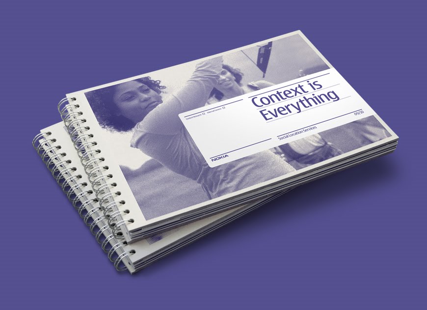
These are all examples of spreads that I've looked at from unexplained mystery and UFO books I've been looing into, I think the grainy photography and the monotone/duotone imagery is a particular staple of this kind of book. I really really like this aspect of these books and want to pay homage to it in my book. At the same time I want to make something that looks modern, simple, almost Swiss in it's design approach. Something that reflects the culture industry that surrounds the book fair that it will be distributed in. With that in mind, here are some examples of contemporary design that are influencing the decisions I am making about my book:

CONTEMPORARY LAYOUT AND BOOK DESIGN:

VAST

This redesign for Elegentia by Vast is lovely. It's very simple and the colour of the type reflects the tones of the photograph nicely. The simplicity and modern approach immediately says culture. It's something I really, really want to try and encapsulate through my own design.

Socio Design

I like this work by socio design because it uses a halftone one colour print which reflects the old magazine stuff I looked at at the start of this post, but the type's clean setting with a large amount of plain negative space around it makes it look very clean and very minimal, again something I want to capture with my own work.

Rolling Stones-Exile On Main Street


The simple colour palette and use of negative space is why I quite like this. Something about minimalism and use of negative space that really says sophistication. I think it's that it doesn't make a big fuss and the lack of 'showyness' makes a statement about restraint.


Konst & Teknik


Again, this Konst & Teknik book called 'Sol & Luna' or sun and moon is really stunning, it uses the monotone photographry that I'm into and the cover's simplicity is really appealing and very Swiss. I love the clean nature of it. It says sophistication.

Mikael Floysand


I like the cleanliness of this, I also like the way shapes have been manipulated using the multiply tool. The triangle becomes a tool to display a quotation without taking up any additional space. It's a clever tool to preserve the lovely white space that surrounds the body copy, unfortunately it does compromise the legibility of the text. This is something to bare in mind if I were to employ this technique.

Julian House


I chose this because it's minimal, but it uses bold colour and really unusual shapes to make something simplistic but really unique.

Homework

This set of magazine layouts by Homework demonstrates how simplicity along with bold typographical choices can be used to create quite a sophisticated look that reflects contemporary culture successfully. Throughout the process, I need to make sure I keep in mind this sophistication that I need to the magazine, to avoid getting too showy with it.

Esquire


This is a lovely use of duotone to create a really strong identity and sophistication. The spreads themselves perhaps have a little too much going on for my taste and for the magazine I'm doing but they do some interesting things with layout.

Tuesday, October 5, 2010

UV ink responses

So these are the responses to my earlier posted inquiries about UV inks:
'Hi Ben
We do have such products but they are very expensive & only brought into order as follows:

UV-luminescent inks: They will glow only under exposure of black light (365 nm). So these inks are invisible under normal light and are colored under black light.

Or

Phosphorescent (glow in the dark, after glowing effect) inks: This kind of inks will be white under normal light and collect energy under day light. In the dark they will emit the energy and will glow in the dark.

Cost Per Kg approx. £250.00 plus shipping & VAT

Best Regards
Simon
'- This was the response from a proper screen printing distributer, obviously thats ridiculously expensive and I figured that spot varnishing would become my only option. Then, however I found some water-based ink from blacklight world and their response was:
'I don't see a problem with your question. However the BLUE ink I would use only to show up bright on black paper. Keep in mind Im not a paper expert and different paper chemicals could cause different effect which is why I highly advise some experimentation with your paper or products to insure success.
Our Red & Yellow are for hand stamping and would not work well on paper especially black.


Thank You
Anthony'
So, this is looking up because it's about £14 for 200g of UV ink, which should be more than enough, or at least I hope it will be. There's also some glow ink that Jonny wants so we're probably going to order together, as well as go halves on some paper stock when it comes to it. Which is great. The fact that the best one to use is blue is helpful because it can help define a colour scheme or code with the book it's self.

Monday, October 4, 2010

Print finish:UV/Blacklight/Spot Varnish

Ok, so I set this on my weekend action plan but I've only properly just sorted it out. The screen-print rooms have spot varnish stuff readily available, which is fine. They also have UV reactive ink, but it shows up in sunlight. They told me that as long as I find invisible ink that is black light detectable and waterbased, it should eb fine to mix with the binder and work effectively.

http://www.blacklightworld.com/invisible%20ink.htm this website seems to stock this, but there's a few things I'm not sure about it, so I emailed them and I'm awaiting a response:

'Hi,
I was curious about your Black light, water based ink. How visible is it without a black light (I need it to be as invisible as possible)? Does it work under black light even when it's on darker surfaces? You say it's not permenant, but if I were to put it into a screen printing binder and use it on paper that wasn't to be exposed to water, would it last?

Thank you in advance.

Ben'


Hopefully this goes well, otherwise I need to start thinking of a contingency plan.