Showing posts with label Fashion Label. Show all posts

Friday, November 19, 2010

Research for Garment designs

Two different phrases are needed to be interpreted here for two separate designs:
'The Worst of me is The Best of you.' And I've thought about a few things for this including geometric tessellations and dual tessellations:

http://mathworld.wolfram.com/DualTessellation.html


Especially the dual tessellations, the fact that they are two unique patterns derived from one another kind of reflects the duality of the phrase pretty well. The second black designs are derived from connecting the central points of the first tesselations. This can create an interesting effect and the way it's derived kind of echoes the sentiments of the phrase quite well, whilst avoiding cliche.

Something else that struck me as a reference point to go away and work from was trick illustrations:
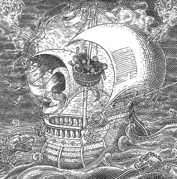


If I could make an illustration more content approprriate that works like these trick drawings, where looking at them in different ways creates different interpretatons of the drawing, then it would also play on the duality of the phrase. I'm not really illustration driven any longer, and this seems like it would draw my focus away from what I want to get out of this module. Plus, I need to get this brief done and out of the way with so I intend to spend a day on each of these briefs, maximum.

"Hand in hand with wonder and disgust" is the other phrase, I think I need to just get drawing and scribbling ideas down with this one because nothing comes to mind. Anyway, here are some designers and t-shirts that I'm looking at in terms of inspiration:


I think what they have in common, really is well chosen/unique typefaces combined at times with geometric or simple pattern/image design and often but not always vibrant colour. I think that vibrant colour is probably something that I should start looking at more and more as Daisy sees that as an important part of her brand. Anyway, I think I've got enough research to star going away and thhinking about how to use it.

Tuesday, November 9, 2010

Varsity/Chinelle Logos

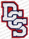
For one idea for Daisy's logo because it plays on youth culture and street wear, I was looking at the kind of lettering you get on baseball jackets, that kind of high school in america look. I think I could use these visuals and twist them into something that suits the kind of macabre image of some of Daisy's work:


Wednesday, September 29, 2010

Stationary I like

Here's some unique stationary I've come across and why I think it's successful and things I can take away from it:


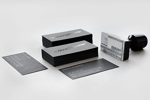
I like this bit of stationary for the street hearts because it's very minimal and simple, even with colours. Opting for pure black with a spot varnish to highlight the information. It's a nice sophisticated way of using a high-end finish which is something I'm interested in using for this project for Daisy's branding, stationary and look book.


This bit of stationary for Untitled employs a similar use of spot varnish across a few different stocks. I'm not a big fan of the type they've chosen to communicate the information though, it feels a little clunky.


This identity for Galerist is definitely not my cup of tea. It's very simple like the other two I've already looked at. But it feels a lot more low budge and the paper stocks chosen don't really interest me like the other two did. That being said, I do like the typography for their 'logo'. It's a great font and the leading and weighting look to have been really well considered.


This one is great because of it's application of a colour scheme across a range of medias that really unites them as a set. I'm not too keen on the use of Clarendon on the front of the invite. It just feels clunky and awkward as a piece of body text. I personally feel that Clarendon is OK as a title font, but it doesn't work as well as functional, readable body type, which is kind of how it is being used here.


To be perfectly honest, the main reason that I picked this to show isn't really the design elements, but actually the blue in that packaging is quite excellent. I guess that demonstrates the power of well chosen colour.


I chose this because it's quite a unique identity and the stationary chosen applies to them really well and it's really well presented here. I love the sort of 19th Century feel to their logo and the way it's been applied cleverly to a colour system of white, black and red.


I think this highlights very nicely, how sometimes the simplest of things are actually the nicest of things. The use of negative space really, really works effectively.