


These are all examples of spreads that I've looked at from unexplained mystery and UFO books I've been looing into, I think the grainy photography and the monotone/duotone imagery is a particular staple of this kind of book. I really really like this aspect of these books and want to pay homage to it in my book. At the same time I want to make something that looks modern, simple, almost Swiss in it's design approach. Something that reflects the culture industry that surrounds the book fair that it will be distributed in. With that in mind, here are some examples of contemporary design that are influencing the decisions I am making about my book:
CONTEMPORARY LAYOUT AND BOOK DESIGN:
VAST

This redesign for Elegentia by Vast is lovely. It's very simple and the colour of the type reflects the tones of the photograph nicely. The simplicity and modern approach immediately says culture. It's something I really, really want to try and encapsulate through my own design.
Socio Design
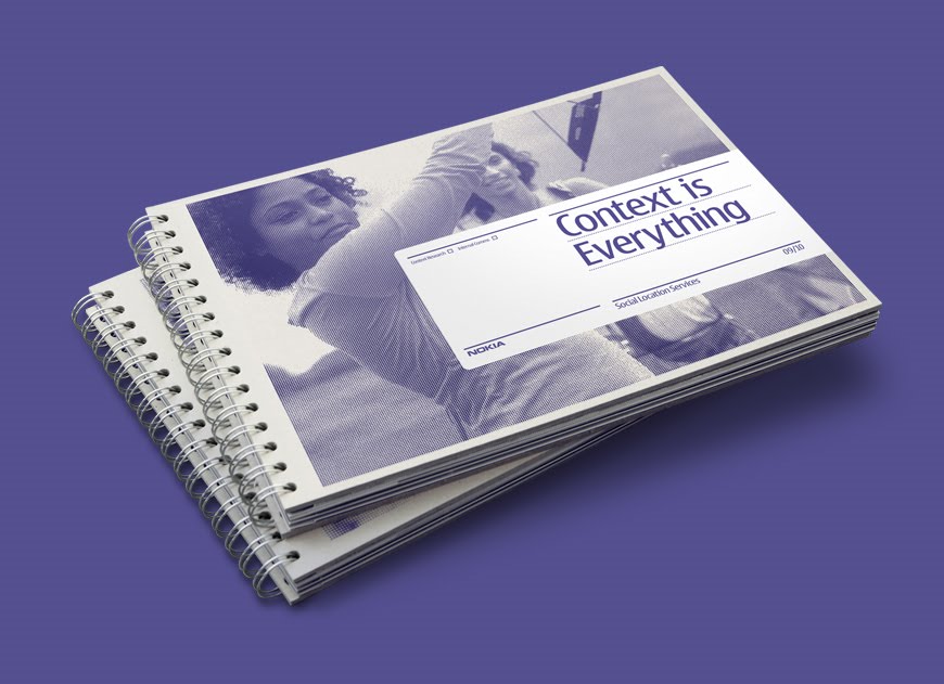
I like this work by socio design because it uses a halftone one colour print which reflects the old magazine stuff I looked at at the start of this post, but the type's clean setting with a large amount of plain negative space around it makes it look very clean and very minimal, again something I want to capture with my own work.
Rolling Stones-Exile On Main Street

The simple colour palette and use of negative space is why I quite like this. Something about minimalism and use of negative space that really says sophistication. I think it's that it doesn't make a big fuss and the lack of 'showyness' makes a statement about restraint.
Konst & Teknik


Again, this Konst & Teknik book called 'Sol & Luna' or sun and moon is really stunning, it uses the monotone photographry that I'm into and the cover's simplicity is really appealing and very Swiss. I love the clean nature of it. It says sophistication.
Mikael Floysand

I like the cleanliness of this, I also like the way shapes have been manipulated using the multiply tool. The triangle becomes a tool to display a quotation without taking up any additional space. It's a clever tool to preserve the lovely white space that surrounds the body copy, unfortunately it does compromise the legibility of the text. This is something to bare in mind if I were to employ this technique.
Julian House

I chose this because it's minimal, but it uses bold colour and really unusual shapes to make something simplistic but really unique.
Homework

This set of magazine layouts by Homework demonstrates how simplicity along with bold typographical choices can be used to create quite a sophisticated look that reflects contemporary culture successfully. Throughout the process, I need to make sure I keep in mind this sophistication that I need to the magazine, to avoid getting too showy with it.
Esquire


This is a lovely use of duotone to create a really strong identity and sophistication. The spreads themselves perhaps have a little too much going on for my taste and for the magazine I'm doing but they do some interesting things with layout.
No comments:
Post a Comment