Monday, November 22, 2010

Contacting the societies

I've decided to contact these societies in order to try and get some copies of the rules, in order to make a rulebook to send out:

I've tried to be as frank as possible, I'll let you know about the results. If they respondpositively, I'll be able to get other things out of it, or at least that's the hope anyway.


FInding other societies:

After my initial discussions about this project, I decided I really wanted to a membership pack fro a magic society, not THE magic society 'The Magic Circle' but a smaller one with a more unusual name.

This Website
has an alphabetised list of all UK based magic societies. The two that look the most promising are the Pentacle Club and the Order of The Magi. As you can see, the design for both is extremely lacking and there's perhaps an option to propose websites with this brief as well. I think I'm more inclined to go with the Order of the Magi, because their name is a lot more ambiguous and open to reinterpretation. The pentacle club is very literal, and the order of the magi seems more steeped in history as a name. Despite the Pentacle Club's 90 year history.

After an extensive search looking through societies, guilds and clubs I came across, the one that provoked the most intrigue was the UK Guild of Taxidermists

Now I've got my subject matter, I need to contact them to get things like their headquarters/contact address, their mission statements and their rules and regulations. Now I'm going to go away and start looking at ways to represent these societies.

Friday, November 19, 2010

ISTD Fakery Brief

I'm doing te ISTD fakery brief, Here is some quick research of things that I'm aware of that I though were interesting in terms of faking, hoaxing and frauds:


The Yes Men are a group of people aiming to improve the world. In this elaborate stuns they made their own version of the New York Times, with headlines thy think the world would want to see. I really like how clever this is, by using the signs and signifiers of a formal news paper, they briefly tricked people and by doing so they established a point.


The Cottingley Fairies is a hoax local to Bradford that my Grandparents had hanging in their bathroom when I was much younger. It was perpetrated by children and fooled many. I quite like the idea of working with something local like this.

http://roadtickle.com/7-famous-hoaxes/

"Bath tub hoa
This story has been spread around for years, often being quoted by doctors as proof of culture overcoming common sense. The basic story, first published in 1917 claims that when the bathtub was first introduced in the U.S. people refused to use it because they believed that baths would hurt their health. Apparently what helped the bathtub was the fact that in 1850 president Millard Fillmore ordered a bathtub be installed in the White House.

However, in 1926 the original author of the article admitted that everything he wrote about the bathtub was false. He apparently made up the story as a funny, light piece to run in the Evening Mail. He didn’t understand why people believed everything they read without conducting further research and wondered how many other bits of common knowledge were completely made up."

The point about believing everything they read is pertinent to the power of an author or a typographer, thy can make something seem believable as long as the document it's self is presented in a sophisticated and professional manner.

I do believe the best approach to this brief is to create something that does involve creating a deception of some kind, and using the way the type is laid and set out to make it convincing. If the idea is strong and clever enough then it definitely becomes a piece that could win the ISTD award.

http://thedailymash.co.uk/
This is a sight that kind of takes the news and satires in it. the stories are fake based on fact. This kind of thing could be an interesting and comical way to take it. I'm not sure how interested I am in going down this road though.

I'm going to go away and do a bit of brainstorming and then pursue a few lines of enquiry.

Research for Garment designs

Two different phrases are needed to be interpreted here for two separate designs:
'The Worst of me is The Best of you.' And I've thought about a few things for this including geometric tessellations and dual tessellations:

http://mathworld.wolfram.com/DualTessellation.html


Especially the dual tessellations, the fact that they are two unique patterns derived from one another kind of reflects the duality of the phrase pretty well. The second black designs are derived from connecting the central points of the first tesselations. This can create an interesting effect and the way it's derived kind of echoes the sentiments of the phrase quite well, whilst avoiding cliche.

Something else that struck me as a reference point to go away and work from was trick illustrations:


If I could make an illustration more content approprriate that works like these trick drawings, where looking at them in different ways creates different interpretatons of the drawing, then it would also play on the duality of the phrase. I'm not really illustration driven any longer, and this seems like it would draw my focus away from what I want to get out of this module. Plus, I need to get this brief done and out of the way with so I intend to spend a day on each of these briefs, maximum.

"Hand in hand with wonder and disgust" is the other phrase, I think I need to just get drawing and scribbling ideas down with this one because nothing comes to mind. Anyway, here are some designers and t-shirts that I'm looking at in terms of inspiration:


I think what they have in common, really is well chosen/unique typefaces combined at times with geometric or simple pattern/image design and often but not always vibrant colour. I think that vibrant colour is probably something that I should start looking at more and more as Daisy sees that as an important part of her brand. Anyway, I think I've got enough research to star going away and thhinking about how to use it.

Wednesday, November 17, 2010

Aleister Crowly/Thelema

This is going to be my last of the series of 6. I'm really interested in Aleister Crowley, his life is very exotic and unique. He founded a religious form of thinking called Thelema that fits nicely with the idea of cult, at the time it was seen as dangerous and satanic by those who thought Crowley to be the beast incarnate. Here is some research into the cult, I need to find some elements that I can play off of in a similar way to the rest of the series. I want to play on the idea that people at the time believed him and his beliefs to be of the devil by being black heavy, perhaps even using black foil-blocking as the unique finish.

Anyway, here is some research I've been doing into it:

http://en.wikipedia.org/wiki/Aleister_Crowley


http://en.wikipedia.org/wiki/Thelema


Obviously not the most reliable source but it goes quite into depth and uses a lot of quotations from Crowley himself. The system of beliefs is sometimes quite complicated, but can be summarised by the phrase 'Do What Thou Wilt' with the will reffering to True Will, or your calling/destiny. Most of this is wrapped up in cosmology and Egyptian Gods and Goddesses. The occult symbols that he uses could also be of interest:


http://www.religioustolerance.org/thelema2.htm
The overview summary on this website can easily be edited into appropriate body copy, and it includes a rough membership amount of 100-200 people which is useful. No one appears to have died as a result of the cult, it's true intentions being misunderstood by the scoiety and press of the time.

For the little personal account I'm going to select the quotes of Crowley from the wikipedia page and turn it into a small piece of body copy that summarises his views.


Here's a really large format hpotograph of Crowley that I quite like, but theres some other much smaller ones that are of more interest:

This one is really unique, I love the ceremonial garb and it really captures the theatrical essence of what he was about, so I'm going to search for a version of this image as large as possible and hope it converts into a halftone well enough, if not I can always fall back on the other one.

I think thats enough to work with now, just need to get cracking really.

Monday, November 15, 2010

Membership Pack Brief

Flat Earth Society:
http://theflatearthsociety.org/cms/ is there current website, and they used to do newsletters that looked like this:


As you can see both look fairly dated. There's room to upgrade what they have been doing and what they are doing. According to their page, they've been taking on members for about a year since they restarted and so now would be a good time to start making a decent and worthy pack to send out to new members.

There's an overview of their history and beliefs of the society on the wikipedia page, a little unreliable I know, but it seems to tally with what their website says quite well: http://en.wikipedia.org/wiki/Flat_earth_society

Things that they'll want in the membership pack:
-A membership card
-A newsletter
-A book/document about the rules of the society/a manifesto
-Something to package all of these in a mailable format.

Visuals I can use:

The flat earth model, or a map of the world as they see it, with antarctica becoming a large circle of Ice that surrounds the disk shaped world. This version is coloured and gradiated to depict the world quite accurately, but the way the lines and circles graduate outwards becomes a nice flat and interesting visual unto it's self. This is something that I can perhaps begin to explore.

Visually it instantly sparks images of british explorers from the 18th and 19th century, I think it's something thayt wes Anderson movies have used and turned into something very styllised and current in the credits/design for films like the life aquatic:

And the societies in the film Rushmore:

The font seems veyr similar to Gill Bold, and combined with the imagery feels very British, the quirky and unusual nature of the club is well illustrated by the photograph, though I'm not sure photography is right for this society.


And here is a shot for the title card of the royal tenenbaums that employs similar typography. The colour tones in this are very 60's and 70's with their pastal tones, which I quite like, I think this ties together with the feel of the society that I want to go with.

Things to do:
-Decide on other societies
-Get some visuals for the other societies
-Relate these visuals to more contemporary design
-Use these as decision makers for visual direction of the societies
I design for.

Sunday, November 14, 2010

Rearch into the Order Of The Solar Temple

These are the last two that I'm going to look at, giving me 6 cults, 6 unique explorations of pint finish. I then have to figure out how to maybe expand the brief out a little bit.

http://listverse.com/2007/09/15/top-10-cults/
has quite a long section on them that would be suitable for body copy. Key things to latch onto; their name 'solar temple' conjours up imagery of really vivid yellows and interesting sun-like shapes. I also find that the most shocking/interesting thing about the cult is that they got one of the families to kill their own child, believing him to be the anti-christ.

http://coolopolis.blogspot.com/2007/08/order-of-solar-temple-coolopolis.html
This website has a personal interview with someone who was quite close to the cult. It's quite informative and will fulfill the requirements for the vertical strip of text quite nicely.


Finding an image of a suitable size, even when half toning has been difficult. The cult was quite secretive and their aren't many images available, however, this photo of co-founder Luc Jouret should probably work quite nicely, given that I can scale it up when turning it into a halftone screen.

I think that's all I need, I'm aware that I need to increase the rate at which I'm producing this work a little, so in terms of research I need to move quite quickly.

Tuesday, November 9, 2010

Varsity/Chinelle Logos

For one idea for Daisy's logo because it plays on youth culture and street wear, I was looking at the kind of lettering you get on baseball jackets, that kind of high school in america look. I think I could use these visuals and twist them into something that suits the kind of macabre image of some of Daisy's work:


Wednesday, November 3, 2010

Daisy Shayler Webb's fashion label (LIVE BRIEF)

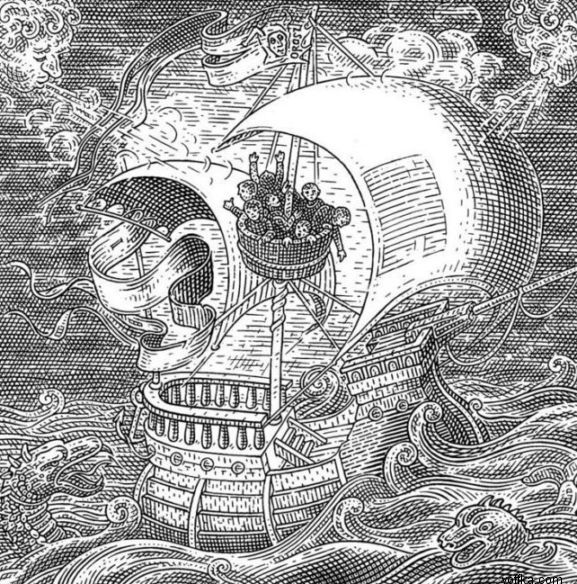
Ok so this is a collection of things from talking to Daisy and things that she has given me. Firstly she presented me with a few of these images that she felt would give me a visual clue.

I think the main points she wanted to get across are this combination of color and the macabre.

I asked her to give me a few similar fashion labels as well as a description of how she would describe her audience. She gave me the following examples:
Comme Des Garcons


As you can see, this collection of fashion is very modern street fashion, but on the high fashion side of this kind of wear. Daisy described it as 'arty relaxed fashion'. this definitely fits that bill.

Vivienn Westwood:

Again, I think the point she's trying to get across is the combination of street fashion with the more high end and out there, the make up gives me a sense of the experimental and more 'out there' approach to streetwear/relaxed fashion.

Mine and Daisy's collaboration


Finally there is a colaboration that myself and Daisy did over summer. Theres a combination of this kind of macabre vibe that her initial pdf document she sent me suggests tied to the street-fashion/relaxed style that she's going for. I personally would describe it as 'hipster' fashion, sort of a cultural youth movement of young 18-25 year old artists, designers and those engaged with art cinema and music. Generally of a middle class orientation.

Things I've been looking at on my own:


I appreciate that this bit of branding doesn't have much to do with fashion, but the simplicity of it along with the really nice diagonal line create something that to me looks quite high end. Also the use of overprint/multiply tool is something that on an increasing trend within that area of design, giving this design a little bit of that contemporary culture feeling.

I think I chose this because of the very very simple nature of it along with the strong presence of black which is reminiscent of the Comme Des Garcons stuff that Daisy showed me. I also think the chaotic hand made type is well balanced by the traditional typography, which is very orderly and left aligned. The volume of black and little else going on really allows the hand drawn type to become a feature as well.


This design for 'five' by Kyle Poff is very simple but very contemporary and it looks beautiful applied to the spring summer catalogue design, taking on a very vibrant and colourful approach through it's setting. The typeface it's self is a great balance betwen traditional serif and an unusual unique typeface, which means that it can appear playful, as it does in the catalogue setting as well as very formal, as it does on the business card.


I've used this image as contextual research before, but the way the man is dressed combined with thst type of a very thin line weight captures very much the look of Daisy's brand.

I've also referenced this piece for a look book by Phil who graduated last year, but it's an example of branding in a similar kind of way.


This last one is just a very simple logoform but I just think it works beautifully. I need to remember not to overomplicate my designs for the logoform because it needs to be as immediate as this is.


This design for a collection of Skunk Anansie's music is really great, it's an example of strong colour presence in branding and how that can really really create a great identity. It also feels very much a fashion design. These images combined with the shapes, I can picture in a look book or a catalogue. They're also incredibly contemporary looking, which is helpful for the kind of fashion brand Daisy wants to be.