Definition of a book: 1.a written work or composition that has been published
2.physical objects consisting of a number of pages bound together
However, this idea of a book revolves around the format of what a book is, however it doesn't really suggest what a book can be. Personally, I think that a book is simply a device in which information of any kind is held. A DVD or a CD is a form of book, or at least an extension of the idea, holding video and music files instead of written words and illustrations. Here are some examples of how other designers have pushed the idea of book.
Sue Blackwell

Sue Blackwell uses existing book and creates 3 dimensional imagery within the books that reflect the content, the image above uses Alice In Wonderland to create imagery from the tea party. This sort of uses the traditional form of a book to create an illustration. The difficulty with this from the perspective of image as part of design is that it isn't very functional and in fact removes the functionality of the book as a readable body of work making this a more fine art piece. Though it's good to bare in mind how experimental I can go with the manufacture of a book.
Georgia Russell


Georgia Russell similarly plays with the concept of book to create fine art pieces. I really like the vibrancy of colours and the playing with cutting away from the book and the patternt hat this can make.
Brian Dettmer

Brian Dettmer uses a similar approach to Sue Blackwell, however he creates elaborate 3D diaramas. Again this plays with the traditional form of a book, I don't think I'm going to do something like this, I'd rather look at what a book could be, rather than playing with it's traditional format.
Ollie Saward (heeheee)

I chose to look at Ollie's first year book project because it really challenges the convention of what a book can be. There are no pages, no binding etc. It's a book in it's simplest form, a vehicle for information, in this case a series of found faces. Whilst I don't have time to create something this sophisticated, I do want to bring the concept of book to it's most basic, I think this will be kind of freeing as well as allow me to skimp a little on budget (of which I have very little)
For the book it's self we can pick to base it around a shape, a colour, a typeface or a sound. I thought it would be nice to combine the two, so I'm going to design a typeface around the colour blue, using the connotations and social interpretations it carries to inform it's form and style. Here are some facts about blue:
" * In the English language, blue often represents the human emotion of sadness, e.g. "He was feeling blue". In German, on the other hand, to be "blue" (blau sein) is to be drunk. This derives from the ancient use of urine (which is produced copiously by the human body after drinking alcohol) in dyeing cloth blue with woad or indigo.[5] It may also be in relation to rain, which is usually regarded as a trigger of depressive emotions.[6]
* Conversely blue, a very popular color[7] can represent happiness and optimism[8] as days with clearer, blue skies tend to be considered times where these emotions are more easily expressed. Many artistic contributions have been made referencing clear days with blue skies as part of the happiness or as a symbolism of the happiness the artist felt, such as Tony Bennett's Put on a Happy Face.[9] If this were untrue there would obviously be more complaints about days with clear blue skies.
* Blue is commonly used in the Western hemisphere to symbolize the male gender in contrast to pink used for females.
* Blue is associated in Christianity generally and Catholicism in particular, with the Virgin Mary.
* Blue in Hinduism: Many of the gods are depicted as having blue-coloured skin, particularly those associated with Vishnu, who is said to be the Preserver of the world and thus intimately connected to water. Krishna and Ram, Vishnu's avatars, are usually blue. Shiva, the Destroyer, is also depicted in light blue tones and is called neela kantha, or blue-throated, for having swallowed poison in an attempt to turn the tide of a battle between the gods and demons in the gods' favour.
* Blue in Judaism: In the Torah,[13] the Israelites were commanded to put fringes, tzitzit, on the corners of their garments, and to weave within these fringes a "twisted thread of blue (tekhelet)".[14] In ancient days, this blue thread was made from a dye extracted from a Mediterranean snail called the hilazon. Maimonides claimed that this blue was the colour of "the clear noonday sky"; Rashi, the colour of the evening sky.[15] According to several rabbinic sages, blue is the colour of God's Glory.[16] Staring at this colour aids in mediation, bringing us a glimpse of the "pavement of sapphire, like the very sky for purity", which is a likeness of the Throne of God.[17] (The Hebrew word for glory.) Many items in the Mishkan, the portable sanctuary in the wilderness, such as the menorah, many of the vessels, and the Ark of the Covenant, were covered with blue cloth when transported from place to place.[18]
* Blue in Islam: In verse 20:102 of the Qur’an, the word زرق zurq (plural of azraq 'blue') is used metaphorically for evildoers whose eyes are glazed with fear, as if the sclera is filmed over with a bluish tint.
Symbolism
* In Thailand, blue is associated with Friday on the Thai solar calendar. Anyone may wear blue on Fridays and anyone born on a Friday may adopt blue as their colour. The Thai language, however, is one that has had trouble distinguishing blue from green. The default word for Blue was recently สีน้ำเงิน literally, the colour of silver, a poetical reference to the silvery sheen of the deep blue sea. It now means Navy Blue, and the default word is now สีฟ้า literally, the colour of the sky.
Sociology
* Dark blue represents knowledge, power, integrity, and seriousness.[citation needed] In Western civilisation, those in the upper classes in high places of political or economic power often wear dark blue suits. Ordinary members of the working class (especially those who work in the computer industry) often refer derisively to these management functionaries as the suits.[24] This terminology is also used in the television industry--the network executives are often referred to by the creative people (actors, directors, and screenwriters) as the suits.[25]
* Blue can also represent the working class. A blue-collar worker is a member of the working class who typically performs manual labour and earns an hourly wage. Industrial and manual workers wear durable clothing that can be dirty, soiled, or even scrapped at work. A popular element of such clothes has been a light or navy blue work shirt. Blue is also a popular colour for work coveralls."
I'm interested in blue's nature as serious and depressive as well as the visual imagery that the idea of ocean connotes. Obviously I want to be quite illustrative about the typeface so I'm looking to hand drawn type for inspiration.
Below is a piiece of illustration by Anna Wray, I think that trying to create something quite detailed and ornate in the typeface I create would be an aesthetic I'd like, btu I need to make sure I keep the content appropriate to the colour blue rather than making an unclear typeface for the sake of detail.

Below is some hand drawn type by Paula Mills, I like the style that she has chosen, however the colour choice is garish and a little unpleasant. It's important to remember colour choice can make or break a piece.

Conversely to the prior piece, I think the colour choices in this piece by Ray Fenwick are really nice.

I chose this typeface by Onomatopee because, whilst I do like it, legibility is an issue. It's hard to make out what the letters say, I need to ensure that theres a clarity to my typeface that allows it to function fully.

I really enjoy the way this piece by Ben Javens works. I like the hand drawn type and the colour choices (it might be worth trying to put a few shades of blue into my design) as well as the grainy aesthetic it has going on. The simplicity gives the piece a clarity that to much detail might of crowded. In designing my own typeface I have to beware of becoming too elaborate.


 I chose to look at Ollie's first year book project because it really challenges the convention of what a book can be. There are no pages, no binding etc. It's a book in it's simplest form, a vehicle for information, in this case a series of found faces. Whilst I don't have time to create something this sophisticated, I do want to bring the concept of book to it's most basic, I think this will be kind of freeing as well as allow me to skimp a little on budget (of which I have very little)


 I got some book vouchers for my birthday recently, and thought this book was a useful edition to my library as well as specifically for the project. The cover it's self shows sort of some of the paper craft techniques that myself and Vickie have been talking about employing for the project.
 I think it's also important to consider the fact that we're designing for a 3D space, and whilst the paper stuff is suitably playful, I feel it's important to look at installation work, even if it doesn't use these techniques to look at the importance of composition etc. when tackling a 3-dimensional space. Ellis' work uses a very limited colour palette, as well as vintage objects that I'm sure Vickie would be an admirer of. I think in terms of coposition, he's managed to get a balanced spread across the walls that avoids looking top or bottom heavy. The placement of the objects in the foreground of the upper image is designed to be looked at from one view, but I imagine he has considered that it will be looked at from lots of different angles also. Something Me and Vickie should bare in mind when we begin composing the piece.


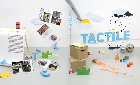 I like the idea of using simple geometric shapes and bright colours in this sort of tactile way, it creates a really nice and quirky aesthetic that we could quite easily utilize.


