Wednesday, September 29, 2010

Stationary I like

Here's some unique stationary I've come across and why I think it's successful and things I can take away from it:


I like this bit of stationary for the street hearts because it's very minimal and simple, even with colours. Opting for pure black with a spot varnish to highlight the information. It's a nice sophisticated way of using a high-end finish which is something I'm interested in using for this project for Daisy's branding, stationary and look book.


This bit of stationary for Untitled employs a similar use of spot varnish across a few different stocks. I'm not a big fan of the type they've chosen to communicate the information though, it feels a little clunky.


This identity for Galerist is definitely not my cup of tea. It's very simple like the other two I've already looked at. But it feels a lot more low budge and the paper stocks chosen don't really interest me like the other two did. That being said, I do like the typography for their 'logo'. It's a great font and the leading and weighting look to have been really well considered.


This one is great because of it's application of a colour scheme across a range of medias that really unites them as a set. I'm not too keen on the use of Clarendon on the front of the invite. It just feels clunky and awkward as a piece of body text. I personally feel that Clarendon is OK as a title font, but it doesn't work as well as functional, readable body type, which is kind of how it is being used here.


To be perfectly honest, the main reason that I picked this to show isn't really the design elements, but actually the blue in that packaging is quite excellent. I guess that demonstrates the power of well chosen colour.


I chose this because it's quite a unique identity and the stationary chosen applies to them really well and it's really well presented here. I love the sort of 19th Century feel to their logo and the way it's been applied cleverly to a colour system of white, black and red.


I think this highlights very nicely, how sometimes the simplest of things are actually the nicest of things. The use of negative space really, really works effectively.

Interesting type design

I'm really drawn to this collection of typography below and how the letters are legible, yet they become almost weird glyphs that, to me, have a bit of mystery and an unusual quality about them that I find fascinating. I really want a custom typeface like these for my book, but I hate designing fonts. I tried it over summer. I came up with an ingenious solution though! I briefed David Gasi on designing me a font for the headers of the book. Anyway I'll put that brief up on my design practice blog but whats important is that I gave him a pdf with visuals attached, all of which are in this blog post:


Not strictly a typeface, more a collection of glyphs. I love the roundness of the counter-like shapes and the thin line weight. It's context as a giant header is also significant, there will be points in my book where I'm going to want to do something like that.


I saw this typeface whilst Ross was doing some research and asked him to email me the file. Again the really thin line weight combined with the unusual shapes and characters with this almost geometric quality create the feel of glyphs in my mind.


OK so this isn't a typeface but my research into the symbols they use and stuff uses a lot of triangles a=especially with freemasonry's roots in 'sacred geometry' so the aesthetics of this are really pleasing and the way the eyes are replaced by yellow circles kind of alludes to mind control, and hypnosis.


I think I'm goig through a phase of enjoyment of very thin type faces so this one sticks out, I also like the way its one typeface laid over a very different typeface to create two unique looks that work as one.


Again, this isn't strictly a typeface, but the use of eyes and those kinds of shapes can really make a unique typeface and it's good for David to not only look at typefaces but to draw from the inspiration of shapes, imagery and concepts as well.

Signs and symbols of the conspiracies

Here is some research into signs and symbols that are interesting and weirs, I;ve made notes on them and just posted them to my design practice blog because it pertains to how I'm going to use them.

http://thebiggestsecretpict.online.fr/nwo.htm This amazingly hideous looking website does have a rather nice collection of the signs and symbols which I can draw from and put into my book.

http://www.ufodigest.com/news/1106/aliensymbols.html this has a load of allegedly alien symbols which could create a real unique and mysterious quality to my book if I use them well.
http://www.abovetopsecret.com/forum/thread446986/pg1 And here is some more!

Really good links for getting some symbols and imagery, even if they are so incredibly badly designed.

Thursday, September 23, 2010

Some small zines and independent publications.

I thought it best to look at the way some independent publications have been written and such in order to kind of inform what I want to do.
Arc


There's a few really great things that I like about this book. Firstly, the strong presence of the blue that creates a coherency throughout. Secondly, the grid system of 2 columns works well in terms of readability for a document at that size. One column would have created lines that are too long and have the reader starting to drift off, whilst a three+ column grid would create a line length much too small causing the reader to jerk awkwardly through the constant line changing. Thirdly the use of full page photography and images creates a nice balance between the pages and avoids over saturating what is essentially an art book, with words. Finally, the fact that they've used a specialist font for the cover title and subsequent chapter headers is really nice and the roundness of the counters and legs in the font really suits the title of the book. Perhaps finding a high quality custom font should be something I look at doing that really promotes the idea of conspiracy/mystery/secrets/signs and symbols.


Infinite Library by Camer and Epaminonda

I chose this one because I found the graphics overlaid on the photographs really intriguing and fascinating. Their symmetry creates a really nice aesthetic quality and the ambiguity of their purpose really draws my attention into reading and discovering the contents of this book. Given that my book is about conspiracy theories, mystery and intrigue is a quality I should really aspire to developing throughout it.

Dogcrime- NoBrow publishing

I chose this one because normally I really like No Brow, they produce some really lovely art books, but I really, really hate the body copy in this book. The font size, to me, feels much to big, and the line length looks much too long. The story isn't a childrens book at all, and I feel like the type and layout is insulting in that it patronises you. This is definitely something to look out for when I'm creating my book, it can easily be avoided by proofing your work with cheap black and white print outs. A process I must follow if I'm to produce a book to a high standard.

Hootenanny Newspaper: Stephen Ball, Kim Chan, Tom Pollard and Ryan Van Kesteren

This book is produced by students that have just graduated from Lincoln (they were third years at the time) and I think it's impeccable. A document of extreme quality that shows exactly the potential that students can achieve. In the example spread I've picked, I really love the pyramid like structure of the columns on the left hand page, where it progresses from a 1 column title, to 2 columns of text followed by 4 columns of what appear to be details. It creates a really pleasing aesthetic, and the fullness of the page is balanced well by the series of photographs on the opposite side.

Fine Art Show book- Miles West

This, again uses the 2 column structure very effectively. It also creates a really strong structure of rows. Meaning that the white space between the type and the image allows both to breathe in a very minimalist setting. The use of negative space is something important to consider in my publication also. To much of really full on

No. zine- Patrick Fry

I've known about No Zine for quite a while, it was featured in Grafik - which I subscribed to before it went under- Although I do love the visuals for it and it's got a nice unique identity with its logo, the reason I actually showcased it is to highlight how a nice concept is the most significant thing about a body of work in publishing. No Zine is a collection of work each month of several artists, all of which is based on the number of which issue it is, so for example, issue 1 of no. zine is full of the work of designers about the number 1. I think this is a really lovely concept that produces a really diverse range of work and a really sell-able idea.

Jens Nilsson

I chose this because the strong presence of colour using paper stocks is really nice and the balance of the pages is really nice, essentially the layouts being a reflection of one another, creating a nice symmetry.

Condiment

I chose this for a couple of reasons also. Firstly, I like the balance between the darkness of the photograph and the vivid white of the paper stock. Secondly, the way the type is laid out in equal thirds of the page, with the header and footer text reflecting each other creates a nice symmetry which I find aesthetically pleasing, particularly when they align with the top and the bottom of the fruit stack in the photo really nicely, anchoring the words which could otherwise be lost in the white space.


Pasta- Hildebrand and Kenedy


This book is really nice because it uses only black ink on white paper but still holds the interest of the reader through interesting vectors and fascinating graphics as seen in the spread. Also the grid is quite inventive, the book appears to use a 3 column grid, but one column (presumably notes and details about the image) is half the width whilst the body copy appears to take up 2 columns. It kind of creates a balance that's aesthetically pleasing whilst feeling a little fresher by defying the very traditional way of using a grid.

Things I need to research still:
-Why do conspiracy theories intrigue people? ask my target audience (art school students, peers etc.)
-Does anyone in this audience believe in conspiracy theories? This could effect how I present the information, do I portray the theories in a positive light? am I dismissive and scathing? or do I take a balanced approach?
-Obviously look at as many publications as I can
-Imagery that people associate with conspiracy theories/secret societies/mystery in general.
-Research possible title fonts etc.

Things what I admire and that...

I think it's a good idea to look at work from the year that has just graduated that I admire. This kind of sets the standard and also informs the direction I want to take with this module.


Anand's collaboration with Generation press for his identity is absolutely stunning. Really nicely chosen stocks, colours and a clever identity using the ampersand to make the and in his name, which is awesome. I need to find ways this year to equal this level of high end output. This is where I need to make the major step up as my production values have been a bit shonky on more than one occasion previously.


This is a book for NASA by student Tom Pratt, I think in terms of using bold imagery and the amount of body copy it actually utilises, it's probably comparable to the direction I want to take the Manchester book fair brief in. Although obviously I want my own unique style this is a very clear way of laying out a book that punctuates each section quite nicely. The simplicity of the design is the key and as I say, these people were on my course, so this kind of professionalism is definitely achievable.


This is a collaboration between Phil Armison and Tom Pratt, I just love the range of products that the resolution is applied to. This is something to consider when looking at my Magic Society brief, how does everything tie together?

Below is more of Phil Armison's work, I love the balance in the publication between the bright photograph and the simple, slick vector work next to it. They balance really well and showcase how a designer can colaborate with a photographer/fashion student to get great results!


This promotional card that ties in with it, again, is a nice way of applying design across a range of products.


So yeah, there's some lofty standards and I fully aim to reach them with the portfolio I produce from this module.

Magic Society decisions

Right, I need to make a few decisions, right off the bat. What to include: Poster, membership card, a newsletter/mini publication about prominent members/current affairs of the society and then a fourth item that I'm not sure about, but I'm leaning towards applying a similar aesthetic that I've used across the board to playing cards (a staple of early magic) and with this maybe an instruction booklet on simple magic tricks? When I've designed these items, I can then think about how to successfully package them in a clever way.

Theres a few directions that I can take this in too, but I'm looking at how to visually incorporate the idea of illusion into the branding. A list of things to research:

-Print promotion design that I admire
-Optical illusions
-Existing magic societies
-Young people's views on magic
-How and why magicians got into magic

There's a few starting points for me to go away and come back with anyway. Will post my findings soon!

Magic Society Brief

OK, so I found this old ISTD brief about design for a magic society aimed at teenagers. I just think it's absolutely perfect as it is! I haven't changed it, and I'm happy to do it as it is, but I guess we'll have to see after tomorrow's brief writing session. Here it is anyways:

With this brief, there are also several things to consider:
-What kind of teenagers am I going to appeal to? If this is aimed at a nice piece for my portfolio, what kind of audience is likely to engage in the visuals that I want to use?
-The brief isn't all that specific about what promotional materials to make their needs to be at least 4 items including a poster, membership card and packaging. So I need to make decisions on what to include, though I do need to include 500-1000 words of text into one piece.
-I need to create branding, how do the other decisions I make affect the way I brand my products?
-How do I use typography and logoform to create a unique set of visuals that suggest magic or trickery?

Research into conspiracy theories.

Alright, so i did some research yesterday but I think all the excitement made me so tired I crashed, so here is a blog post full of potential content for my book.

Top Ten Conspiracy Theories of All Time:
This is a handy little website, this page in particular highlights some of the most recognisable. I imagine some of these will make up some of the book, but I'd like to highlight a few less heard ones as well. Using websites such as this as a base, I can begin categorising these theories into groups that could then become chapters, which will instantly provide me with a structure to my book. In fact wikipedia (all smirking aside) has got a page that categorises them here:
'* Event conspiracy theories. The conspiracy is held to be responsible for a limited, discrete event or set of events. The conspiratorial forces are alleged to have focused their energies on a limited, well-defined objective. The best-known example in the recent past is the Kennedy assassination conspiracy literature.
* Systemic conspiracy theories. The conspiracy is believed to have broad goals, usually conceived as securing control of a country, a region, or even the entire world. While the goals are sweeping, the conspiratorial machinery is generally simple: a single, evil organization implements a plan to infiltrate and subvert existing institutions. This is a common scenario in conspiracy theories that focus on the alleged machinations of Jews, Freemasons, and the Illuminati, as well as theories centered on international communism or international capitalists.
* Superconspiracy theories. Conspiratorial constructs in which multiple conspiracies are believed to be linked together hierarchically. Event and systemic are joined in complex ways, so that conspiracies come to be nested together. At the summit of the conspiratorial hierarchy is a distant but all-powerful evil force manipulating lesser conspiratorial actors. Superconspiracy theories have enjoyed particular growth since the 1980s, in the work of authors such as Jim Marrs, David Icke, and Milton William Cooper.'

Another way to categorise them would be by subject, rather than style. i.e. You could have a secret society chapter, which would include freemasons, illuminati and David Icke's lizard people theory etc. Then you could have Aliens which includes Crop circles, Roswell and Area 51 etc. You could have a hoax section that includes the moon landing etc. A deaths section that includes famous deaths and assassinations, including JFK, Kurt Cobain, Elvis etc. and then a Medical section that includes the theory about chem trails in airplanes and fluoride in the water.

Which of these two would be most appropriate for my book though, given that I probably have a maximum of 32 pages? 5 chapters/sections would result in between 5 and 6 pages for each section, where as 3 Sections would provide me with 10 and 11 pages for each section. Things to consider are; how does this effect the way it's read? Do I want something that's free flowing, or do I want something that is quite tightly punctuated by subject changes? The content probably informs this decision, if I want to do something quite scholarly, with a lot of body copy, then 3 chapters would probably work more effectively. If I wanted to do a more summative and quick evaluation of each theory, driven by more visuals, then the more chapters are likely to hold the content together in a better and more structured way. This again can be further defined and decided upon by my audience.

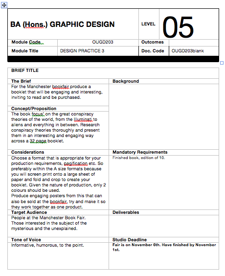
Who goes to the Manchester book fair? Well it's held in the Manchester School of Art section of MMU, which indicates a largely art based audience and a vast amount of potential contacts in the publishing world, therefore it's imperetive that I go with something that promotes what I'm all about. I'm all about doing art books, so I think that I'd rather go with an approach thats less about large amounts of body copy and instead looking at an art book with bold visuals and large headers etc.

This has been a lot of writing because I'm thinking as I go a long and trying to provide some clarity for my ready-to-implode brain. I'm just going to write a conclusion on this massive brain-fart so I know what I'm going with:

-Art book, not a scholarly text, priority on making it visual, not theoretical!
-32 page booklet
-categorised by type into the 5 sections; Secret Societies, Aliens, Deaths, Hoaxes and Medical conspiracies.
-It needs to be informative, but also have a clear concept running through it, that allows it to stand out.
-Something else to think about with this is, what else can I include? a free poster and a t-shirt etc.

Wednesday, September 22, 2010

Please Fred, can I start my brief? 'yes.' AWESOME

OK so this is one I've been dying to get started on ever since I've written it because it encompasses everything that I want to do. Typography, a little work with signs and symbols, layout and book/publishing. Over summer, making the book that I did at the start, I realised that it's probably actually the most fun I've had doing design and the feeling of completing as big a body of work as a book/magazine is thoroughly satisfying.

Amber asked people to submit entries for the book fair and reading the book I've mentioned in my summer blog (b-bowsher0811-summer.blogspot.com), I was instantly interested in doing something unusual and mysterious. I was drawn to the idea of conspiracy theories because I think everyone finds them more than a little intriguing, it's a subject I would want to read about and a wonderfully done art book about it will sell well at the book fair in my opinion. I have a few killer ideas about how to make it even more interesting and collectible, but I'll get into that further into research and on my practice blog. First things first, I need to compile a rigid list of things that are of really important in terms of getting a professional and high class book that will destroy the competition!

-What conspiracies are the most fascinating and should be used as the content?
-Known signs and signifiers that will evoke a sense of mystery or conspiracy such as the infamous all seeing eye of the Illuminati.
-Typography and body copy, i.e. significant research into what works the best in terms of readability and legibility for the kind of document I'm looking at making.
-Grids and their effect on the readability and appearance of my book.
-What paper stocks can I use to create a polished piece of work.

This is all I can think of for now, but that gives me quite a lot to look at and I'm sure there will be plenty more things to come up as I go along/start working through it.

Monday, September 20, 2010