Sunday, May 16, 2010

More visuals

This image by Luke Bott, is really nice vectors, intricate yet simple, with a very good use of colour palette.


Again, simple imagery done right. Not a big fan of the type, but still it looks really good.

Visual inspirations

Ollie Moss:


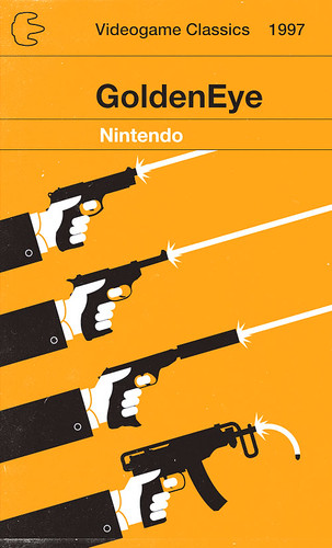
Neat layouts and limited colour palettes were an inspiration, I really enjoyed the simplicity of his work and tried to apply it to my own stuff.

Saul Bass, who's stuff is again about simple shapes and limited colours, something I tried to apply to my own work as often as I could.


This LP by Laura Marling, I didn't like the hand made type so much but the limited colour palette and simple imagery is really striking.

Saturday, May 8, 2010

Physical advertising.

In bookshops:
I went to Waterstone's today, unfortunately I was stopped from taking photographs by a staff member, so I've tried to find photographs on the internet as best I can to substitute it. These images are really tiny, I guess it means that I'm going to have to get a few covert snaps of at least the shop windows when I'm out. It has several posters and banners of various formats in the shop windows, generally promoting offers, but some like a Twilight Saga banner, were for specific books. This picture from the internet kind of highlights what I mean:


I also briefly stopped outside of WHSmiths, they didn't appear to do much advertising inside beyond P.O.S. and inforgraphics, and all the shop window advertising was specifically for WHSmiths, with little focus on individual books and releases, more focus on deals, it isn't likely that they would put specific advertising for the book in their windows.


Other places

Traditionally books are advertised in adshels placed strategically on train platforms and tube/metro platforms. The thinking is that this is when a lot of people read in public space and so it's a good place advertise, whilst their headspace is focused on reading. I'm inclined to agree with this thinking, though it's good to think about other public spaces where people read:
-public transport in general
-libraries
This is all I can think of for now, I need to create a more comprehensive list of places to potentially advertise.

Friday, May 7, 2010

Advertising avenues:

As well as propose designs for the packaging and covers of my books. I also have to create advertising for the book series. Here's a few examples of possible channels:
Web Banners:

The penguin site is an obvious place to put it. They have a section at the top that has a series of different advertisements for publications they have out at the minute. Designing a web banner to these dimensions would be useful, also because in the three main online bookstores below, they all (except for amazon) have a similarly sized web banner space at the top. It;s quite obvious that these should be big channels to promote the book online (both in physical format and in e-book form). Amazon use web banners at the side, as do a number of other websites that might be appropriate, so it's likely that creating one this size for websites such as this would be useful too.


E-books/i-book app

Below is one link to a website that does e-books, they have a similar web-banner to Waterstones at the head of their site that promotes new releases. Websites like this are also an important target. So I need to get a multitude of web banner sizes, mainly for the page header section, so I can advertise on a multitude of websites.


Another important and revolutionary element, is the ibooks app for the new i-pad, which already has penguin's backing. It's important to propose designs for the way covers might work in this format as well as the package as whole, especially given the new bookshelf layout of the library, it's going to be interesting to see how my designs can fit within that format.

Also, there is a book store that also has web banner space to promote new releases to the library. Again, given that it's got penguin onboard, it's likely that this would be an excellent format for advertising.

Physical advertising:
Physical advertising is the most difficult in terms of finding really useful venues to promote books. Posters for libraries and bookstores need to be investigated, as well as the traditional train station adshels. as well as other good venues to use this kind of advertising. These need to be investigated more thoroughly, and a trip to town tomorrow will allow me to do this.

More interesting book packaging

I went to thedieline.com, hoping that they'd have some packaging for books, and they did. Below is a die-cut book cover, the typography being cut out to reveal imagery below. I think it's a really nice effect and it does say 'special edition' or 'collectible'. It kind of emphasises the effort put into the design. If I was able to use the laser cutter, then this would be do-able. Sadly, I missed the inductions, so unless I can wrangle help from someone already inducted, it doesn't seem likely that I'll be able to do this. A shame, because it looks amazing.


I like these moleskins because because of the debossing, but also, the belly bands are a really nice way of packaging things that allows you to save on paper waste an production. This would be something to consider if ethical awareness was on the agenda. However, the brief sort of implies that it's a special collectible edition of books and therefore the packaging should demonstrate this. However, there could be ways to make a belly band appear nice and collectable, techniques such as foil blocking spot varnishing, embossing etc. although I'm not sure how possible embossing is.


I like that theres a hand stitched bookmark in these books, but to be honest, other than that they're pretty average. Also, I don't think I'll use this technique. I just thought it was a bit clever.


Below are mini-books of classics, packaged like cigarette cartons. Although I don't find this in any way appropriate to the material it's packaging, it is a very unique way to package the goods. I'm not sure how I could apply this kind of thing to my own packaging, other than trying to really think outside the box.

Thursday, May 6, 2010

Blurbs for the given text.

Here are the blurbs for the books I'm looking at. Blurbs aren't specified in the brief and aren't a necessity to include. I think that if it comes down to packaging the books as a special edition, then they're books that the audience are aware of. The cover then becomes packaging for a collector, not a first time reader. The priority shifts from informing the reader of the content, to making it desirable. However, I will talk this over with peers to see if they think I'm on the right track with it or not. And so the blurbs are here if others decide that they're necessary.

Of Mice And Men
Clinging to each other in their loneliness and alienation, George and his simple-minded friend Lennie dream, as drifters will, of a place to call their own. But after they come to work on a ranch in the Salinas Valley their hopes, like "the best laid schemes o' mice an' men," begin to go awry.

The Grapes Of Wrath

"In stark and moving detail, John Steinbeck depicts the lives of ordinary people striving to preserve their humanity in the face of social and economic desperation. A portrait of the bitter conflict between the powerful and the powerless, of one man's fierce reaction to injustice, and of a woman's quiet, stoical strength, The Grapes of Wrath is a landmark of American literature, one that captures the horrors of the Great Depression as it probes into the very nature of equality and justice in America."

East Of Eden
This magnificent novel—considered by many to be Steinbeck's best—is the story of the Trasks and the Hamiltons, two families drawn by the current that brought settlers to the rich farmlands of California. As he traces the families through three generations, Steinbeck retells the Biblical story of Adam and of Cain and Abel, and his characters are forced to re-enact the ancient drama of exile to the east of an always elusive Eden.

Tortilla Flat
Above the town of Monterey on the California coast lies the shabby district of Tortilla Flat, inhabited by a colorful gang whose revels recall the exploits of King Arthur's knights. Soft-hearted, unquestioningly loyal to one another, and in complete disregard of social conventions and expectations, the gutsy denizens of Tortilla Flat cheerfully reside in a world of idyllic poverty.

Tuesday, May 4, 2010

Finishes, materials and packaging ideas:

OK, so I looked at some of my own books to get an idea of some of the things that can be done with hardback books. Below is a book for Juxtapoz magazine. The cover was essentially a matt print on a nice stock, rapped around the board that makes it a hardback. It looks nice because of well chosen stock, however it's very limited in terms of print finish exploration. For a special edition, I imagine fans would want something more in terms of production to make it really collectable and feel as if it's a special edition.


The street sketchbook uses a Canvas like material as the cover, which gives it a nice textured feel that compliments the paint strokes on the cover. It also features a nice spot varnished black design that really stands out. The use of spot varnish could be really significant for me to use in terms of creating a unique feel to the book covers, either as a finish over the top of an object to make it stand out, or over the background to create subtle imagery.


This is a cookbook. I picked it because it uses a technique called foil-blocking to create a very classic finish to the typographical elements. This would be one way to create a very traditional feel to my books, although it could be manipulated to give a really contemporary feel.


The Spiderman:Blue comic book by Loeb and Sale features a paper sleave, which is actually not that interesting to me, though it features a nice typeface. Underneath, however, it features a debossed Spiderman in a darker blue that creates a wonderful finish. The font down the spine uses a similar feeling. In one of the interviews, one of the answers to the favourite book covers section was that he liked the hardback cover underneath the paper sleeve because it was well finished. What this indicates to me, is that in terms of memorable covers and certainly special eition, the hardback bit is more important than a paper sleeve and because of this, I'm likely to work straight with the hardback and not use a paper sleeve.


The Mozipedia isn't mine, it belongs to my friend Craig. I wanted to show it though, because his hair is spot varnished, accentuating an iconic part of Morrissey. It's just a really clever and subtle use of spot varnishing. I also really like the typographical choices in the book. Both these things were pointed out to me when this book came up in an interview with another person.


I then decided to look at a few existing book 'box-sets'. This helps inform ideas of how to package my book. This kind of open edged book that allows you to see the spines is quite a common one, it's similarly replicated in the Lord of The Rings box-set below. The real difference between the books I'm looking at, and these is that the spine size differs greatly, it might therefore not be as advantageous for me to present the spines, leaving a weird unsymmetrical look. I also think that the way this particular Lion, The With And The Wardrobe box-set is designed in terms of the actual graphics is incredibly dated looking.

I really like how this Lord Of The Rings boxset looks, again it uses a box package that exposes the spines, which might not be that useful to me, even though the spine size on these varies, it isn't quite as drastic as the way mine does (from 15mm to 45mm). I really like the simplicity of the design, and I thin this is something I'm acutely aware of needing to do with mine. In terms of making a coherant set and packaging, simplicity is often a help and complexity a hindrance.
P.S. the spot varnish on it is sick.


This Harry Potter box set uses a fully enclosed box, with the books presented inside. I think this type of packaging might be more useful to me, though, this is quite a gimmicky box-set, which is fine, given what the material is. For classic novels like the John Steinbeck collection, though, it's best to go with something with a little more class.


This again, is hardly re-inventing the wheel in terms of packaging, the design is also a little bit all-over the place, with too many stylistic influences going on at once.

Penguin:

Given that the product is for penguin, Here's some of their series' They all work quite well, using colour and/or typographical choices to unite them thematically. The hardbacks that use different colours and patterns are beautiful and work well as a series because of their rigid layout throughout.


My only real issue is the newer 'Great Ideas' series, that is much loser, tying the books together only with a colour. The images and layout vary so differently that I don't see them working that well as a coherant series. The individual covers are nice, but within my own work, I want the books to be tied together with more thought than this.