I recently watched Mo on channel 4, a drama about the latter stages of Mo Mowlem's life, I thought I'd show the credits for a few reasons. Firstly they clearly use after effects, secondly they have hand drawn elements and thirdly, I think they're utterly naff. The hand done elements were completely stationary in themseleves, though they did move across the screen. My issue with this in relation to my own brief is simple really, the hand drawn elements look really dodgy in this because of their stationary nature and it justifies my need to make all the hand drawn elements in my own animation look like stop motion, it gives it a much more organic feel than these credits had.
Ok so the brief for the image module today was to select a random object and represent it like an eye chart, below are a few examples. The challenge is to display the image across the different scales and have it visible and clear as to what it is from 20 feet away, this is designed to get us thinking about this in our own image work and how well it fits with the context where it will sit. I just go the images above to give me a quick idea bout how the layout might need to work. Amber says to ignore the numbers at the side and the sort of line divides, I think this is probably a good idea however, I might include the lines stil because i think they're a nice aesthetic.
Ok so, then we had to pick a random object written on a pice of paper in a bag, I drew hairdryers which really really irritated me at the time. Anyway, I've seen quite a few 'out there' designs for hairdryers but part of the challenge is to create an immediately recognisable image. Below are some of the pictures I assosciate with the traditional shape of a hairdryer.
Traditional pictograms are good at this, they're designed specifically to be displayed and readable across a variety of scales and formats. Here are some for the London 2012 Olympics, they depict the sports they represent with great ease. My issue with stuff like this is that it's too dry and vectory. I would want my stuff to feel more organic and hand drawn.
I thought i'd show this as a BAD EXAMPLE of how image can be used over scale, these prints are too intricate and sketchy and alot of them I personally can't interpret... so it is a balancing acvt, if I make my images too ornate, I could end up with something as inddecypherale as these mad ol' pictograms.
I got the book 'handjob' and I thought it was useful in getting my creative juices flowing both in terms of type as image for my Image module and type to use in my idents for the Movie season brief, so here are some fonts in the book and an analysis of why I like or dislike them (apologies for some upside down, my scanner and software for said scanner don't like to turn things the right way round): I like the one above by Mario Hugo because it's a subversion of a font assosciated with sport and the use of the 3 hand rendered lines has a nice aesthetic look to it, the way it generates the shoulders in s, p and r in particular look beautiful. I also chose it because the retro sports vibe might be appropriate to use in the Ferris Bueller ident, the film it's self has a vibe that seems akin to this font somehow.
I chose this nce simple font with a drop shadow because I though something similar would look good for the breakfast club, if it was all stop motion and shakey, then it would have a nice aesthetic to it. I think I'd make it a little less rounded though, the counters seem a little too spacious for my liking.
I loved the angular nature of this one, it seemed amost greek or like a stone carving, or perhaps representing electricity, I think a font similar to this might be appropriate for the weird science ident. The sort of playful electric nature of it seems to fit well. Obviously I'm going to try the font from the film poster first because it's almost iconic now, however this may be a good backup. I thought the nice regal element and the almost floral flourishes in the serifs made this seem importand and almost an air of cutesy-nobility which might be appropriate for the general John Hughes ident, sort of suggesting he's 'teen-movie' nobility. I really like how intricate yet simple this is and would be really keen to produce something similar myself. This one, I just liked, I also thought this could be used in the John Hughes section, or something similar, however I think it might be a bit aggressive and space consuming, it might be nice to try this in lower case, but such blocky bubble writing might be a bit OTT, I can try something similar and see how it looks though. I chose the one above because it's reminiscent of what I'm trying in the image module, I just really like the aesthetic of the hair, I think it looks excellent, but then again that might just be because it's my default stylistic flourish. I thought a font like this, almost script would work wonderfully for the 16 candles Ident because it's a feminine film and the font says to me cutesy female teen.
The opening credits to Napoleon Dynamite are awesome so I thought I'd post them. I love how inventive and low fi they are with the stuff they use. Although this is too complicated for my own Idents, it'd be nice to have a sort of lo-fi indie aesthetic.
I was looking at these adverts for GOLD because they use alot of hand drawn elements and I'd really like to create a similar sene of motion in my piece, all be it simpler. I am tempted to use a similar central line that sort of grows like a vine with bits of imagery jumping off of it, so yeah, I might try and analyse this one in a bit more depth.
So I was re-watching the Breakfast club and I realised that the music over the opening credits would probably be appropriate, it's 'don't you forget about me'-simple minds. I think that it's slow enough and the lyrical content (to the chorus at least) is such that it can be viewed as a memorial movie season as well as generating nostalgia for the rbeakfast club. I can use the chorus as part of that Ident anyway.
Here are some more visuals that have kind of inspired the look I've gone for with my current attempt at visuals, anyway. I might utilize a different aesthetic in the end. Here is the composition I got to (detailed on my design practice blog If I use this, I want the typography to have the effect you see in stop motion animations, here are some that capture the style I mean: As you can see in this one, the way the image sort of distorts and changes as it moves because it's difficult to draw a pefect version of the image over and over again, I really like this effect and as mentioned before, would like 'the breakfast club' bit to do something similar even if it remains stationary.
Vene though this is more ornate it has a similar sort of distortion as some of the characters move.
And this entrant for a wii competition is exactly what I mean.
In terms of visuals for the composition I have at the minute, here are some of the things that have inspired me: Firstly, Eduardo Recife's combination of hand drawn elements and photography, I find this a really nice aesthetic, and whilst I know we're creating motion, there is no reason why we can't apply this aesthetic to a moving sequence. Again, I liked the combination of photography and illustration (even if it i vectorised) and this is somethign I want to expand on further, I also like the use of bold colour in this one. Finally, whilst this has a kind of aged, limited colour palette that I was looking to for inspiration. I kind of utilized the sort of geometric shapes aspect and then fiddled with it a bit too.
This is some working through for my benefit more than anything: Concept Statement: A series of 5 idents that advertise a season of John Hughes Movies utilizing visuals of the time and that a modern audience for teen films would respond to. Considerations: Shown at all times of day, 9 O clock watershed etc. means that in terms of visuals they can't depict nudity, graphic violence etc. and they can't contain swearing. Given that the films are quite light, I don't think this will be too much of an issue. Content: -The movies themselves, I've decided to limit myself to 4 movies overall and 1 that's almost a summary ident, rather than use planes, trains and automobiles because it doesn't really fit with the other teen orientated movies. -The Channel it's for (see below) -When is this season on, i.e. 'Thursdays at 9pm', 'this monday at 7pm' etc.
What is this for? (context): Idents for a John Hughes Movie Season, but where are they going to go? My choices are Film Four and Sky Movies, they tend to be the most specific film content channels. Here are their own idents and logos:
Film 4
I like that it doesn't involve alot of motion, motion isn't something I'm good at working with, however, I won't be using video footage, it's more likely going to be simple animation work.
Sky Movies
Again the logo is very corporate, and the trailer is quite swish. Out of the two, i feel that film four has more of the vibe that I want to use, but obviously it'll need a little bit of re-appropriating to the content and visual style of my idents.
So at the end of this little section, I've made the conclusion that I'd rather be doing this for Film Four, firstly because I'd rather work with their logos and the motion involved in their idents, secodnly because more people are able to view trailers for film four than they are for sky movies because all of Channel Four's different channels are free and use cross advertising of their channels i.e. channel four has idents for E4 and film four etc. Audience: I see my audience as two-fold: People who were teens and 20-somethings at the time of the film coming out, and people who are teens and 20-somethings now. I feel that I need to interact with both groups more over the next few days to get some more information about the movies and what they like/dislike about them. I've already looked briefly at the different visuals that they would respond to, but I feel that I need to explore more animation that reflects the different audiences, so thats what my next post will hopefully be on.
Ok so over Christmas, as featured in my presentation, I used forums to directly target my audience, after a little bit of a search I found the iRewind forum, which has a specialist 80's Movie section, it's users are commonly people who grew up in the 80's catching up on nostalgia, but there are also contemporary appreciators of 80's movies, this made it an ideal area to do some direct research. A link to my 'thread' is here
Here are some choice quotes and the significance I personally feel they have:
"the dialogue and character relationships are a big part of what makes his movies so great. I also love the way he used music in his movies to elevate the story." - This gives me some clues in terms of content, music I can use for example. The music is quite memorable in each film, so I guess I have to pick a track, or 10 seconds of a track that are heavily assosciated with the film I chose.
"Hughes' great strength was always his characters. You can feel that he was trying to be honest at the same time as creating the standard 'wish fulfillment' of a Hollywood movie. His themes are all timeless, so you can enjoy the movies no matter what the fashions are within the films or in the society as a whole at the time you watch them." - This kind of supports my conclusion on audience, that there will be people from the time the movies were made and a contemporary teen audience that I need to appeal to.
"I think that teen movies these days are pretty much all based on the foundations that Hughes laid. The stereotypical characters that were beautifully highlighted in the letter at the end of The Breakfast Club are ever present in teen series and films alike." -This reinforces my decision to draw on imagery from the movies themselves as well as modern teen movies... they are interlinked quite heavily and it would be nice to feed the way the modern movies are influenced by John Hughes in reverse by using modern teen movie poster art and dvd art to feed into my work on John hughes.
Her i have looked at the way modern teen films tend to associate hand drawn imagery with their visual representation (posters, DVD menus and opening credits). I think it would be useful to utilize this style along with the iconic imagery of the film that I discussed in the previous post. Here are a few great examples. I especially like the Ferris Bueller poster for a special screening in 2006... it emphasises how brilliantly the hand drawn approach can be utilized to engage the audience of these movies (i.e. we immediately know that the red Ferrari is Cameron's dad's that he accidentally trashes towards the end.)
I thought it would be useful to draw from scenes that everyone would remember and I can then use imagery from these in my idents. Ferris Bueller This scene from Ferris Bueller where he does twist and shout on the parade float is iconic.
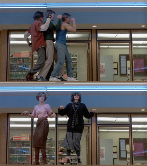
The scene where Cameron wrecks his dad's car is also very memorable and completes a character ark quite nicely. The car in it's self is iconic, so this scene might be useful to draw from. Breakfast Club The dance scene in Breakfast club is by far the most iconic and showing parts of this scene will definitely draw the attention of the people that love this film and John Hughes films in general. Unfortunately I could only get stills rather than actual footage. 16 Candles This scene is quite infamous, but isn't as immediate as the car or the parade in bueller's day off or the dance scene in breakfast club.. they're really iconic. I might need something more iconic like the scene with the actual cake:
Weird Science This image is part of the most Iconic scene in weird Science where the two protagonists' creation first appears: here is a link. I can deffinitely use this, it would definitely appeal to a John Hughes movies fan. Planes, Trains and Automobiles This is the most iconic scene in the movie and is really well known, however it does have quite a lot of swearing in it, so if I were to use it then I would have to recreate the emotion enough visually enough for people to realise where it's from without creating the audio... because If this were a real set of idents then the swearing wouldnt be allowed to be shown.
This gives em a great range of visuals to start experimenting with, using the stylistic elements that are on the presentation I uploaded to my design practice blog.
So I decided to look at some film four movie season idents to see how they're structured, here's a few and a few quick comments. This one for Sci-fi season, introduces the idea first without explanation, and presents something intruiging if a bit ambiguous. Over the ient it becomes more apparent what the meaning is, before it sums it up with a tagline and then tells you what the programming is and when it's on. I really like the idea and the way it's presented is clever and occasionally witty.
The British Connection advert is a different proposition, it shows memorable moments from several of the films in the season soundtracked to a piece of music. It follows a similar structure, idea-tagline ("the British Connection") time it's on. I don't like this one that much because it's not very inspired, however the "please sir, can I have some more?" on the end is a nice little touch that adds a bit of humour.
This one is quite clever, it appears to be advertising one thing (thriller) using Seven as a template, when in fact it's advertsing almost it's opposite in comedy.
These are created in a way that they can be broken into 10 second segments as well (for example, in the sci-fi advert, each person's transformation creates an individual segment that can be used as part of a whole.) this is something I need to be aware of as it's part of the brief. I need to create a sequence that is fluid, yet interchangeable.
These are just the little Idents that present the channel, these are most likely done using simple movements in after effects, but they're pretty effective and strong little idents.


 Firstly, Eduardo Recife's combination of hand drawn elements and photography, I find this a really nice aesthetic, and whilst I know we're creating motion, there is no reason why we can't apply this aesthetic to a moving sequence.
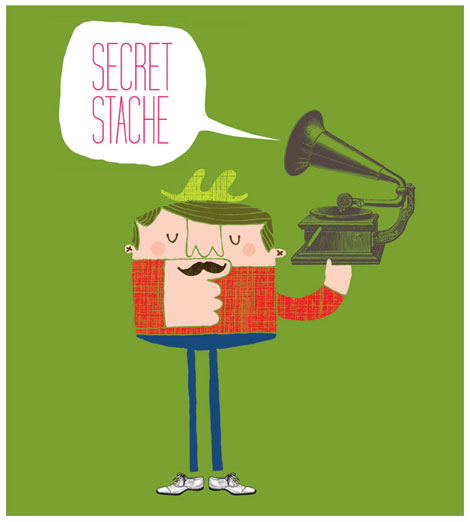 Again, I liked the combination of photography and illustration (even if it i vectorised) and this is somethign I want to expand on further, I also like the use of bold colour in this one.
 Finally, whilst this has a kind of aged, limited colour palette that I was looking to for inspiration. I kind of utilized the sort of geometric shapes aspect and then fiddled with it a bit too.


 This image is part of the most Iconic scene in weird Science where the two protagonists' creation first appears: