If I use this, I want the typography to have the effect you see in stop motion animations, here are some that capture the style I mean: As you can see in this one, the way the image sort of distorts and changes as it moves because it's difficult to draw a pefect version of the image over and over again, I really like this effect and as mentioned before, would like 'the breakfast club' bit to do something similar even if it remains stationary.
Vene though this is more ornate it has a similar sort of distortion as some of the characters move.
And this entrant for a wii competition is exactly what I mean.
In terms of visuals for the composition I have at the minute, here are some of the things that have inspired me:
 Firstly, Eduardo Recife's combination of hand drawn elements and photography, I find this a really nice aesthetic, and whilst I know we're creating motion, there is no reason why we can't apply this aesthetic to a moving sequence.
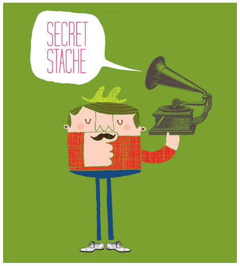
 Again, I liked the combination of photography and illustration (even if it i vectorised) and this is somethign I want to expand on further, I also like the use of bold colour in this one.
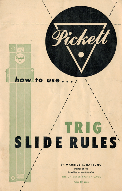
 Finally, whilst this has a kind of aged, limited colour palette that I was looking to for inspiration. I kind of utilized the sort of geometric shapes aspect and then fiddled with it a bit too.
No comments:
Post a Comment